Website accessibility is about more than meeting ADA best practices to avoid a lawsuit. It’s about the social responsibility of offering an online user experience that everyone can enjoy, despite their capabilities.
And for most brands, it’s not that hard to get it right.
Over the past year, more people have started talking about the importance of website accessibility. However, the primary narrative around it is often about avoiding lawsuits, overshadowing (understandably) the true purpose for accessibility optimization.
So here’s the truth: There are 2.2 billion people worldwide with vision impairments ranging from mild, moderate, to severe, and blindness (WHO). Additionally, there are millions of people in the US alone with hearing, vision, or cognitive impairments.
Here are the population sizes according to the Census Bureau:
- Hearing Difficulty: 316,450,569
- Vision Difficulty: 316,450,569
- Cognitive Difficulty: 296,658,475
Yes, inaccessible ecommerce sites are limiting shoppers with disabilities from being able to use the site and make purchases. And you’re right—it impacts your bottom line and can cause a hefty lawsuit.
But this isn’t the purpose of website accessibility optimization; it’s about providing everyone equal access to your ecommerce store.
So what considerations should developers and designers keep in mind when building accessible websites? I'll share information about ADA guidelines and 14 best practices in this article.
Disclaimer: We’re not lawyers, and the information in this article is intended to be for educational purposes only. Therefore, these digital accessibility best practices should not be taken as legal advice. We encourage you to seek legal counsel on how you should approach website accessibility.
First, what is website accessibility compliance?
In plain terms, the ADA, or the Americans with Disabilities Act, is the law that governs accessibility.
We know that if a website or app acts as an extension to a physical store location, it is interpreted as a place of public accommodation under Title III of the ADA. However, this doesn’t mean digital-only brands are off the hook.
For a website to be ADA compliant, it needs to be accessible.
Website accessibility involves strategically using design and code to make the content on your online store available for all users, whether they live with an impairment or not. A significant part of accessibility is also how you create, design, and display content.
It impacts every member of your digital team—from designers to developers and content creators.
"If you're an architect and you're designing a building, you wouldn't just omit ramps. You need that for everyone to get there. It's the same thing with websites."
- Kellie Kowalski, UX/UI designer at Fuel Made
ADA compliance and how it impacts your website
When it comes to ADA compliance, ask yourself two main questions:
Your goal is to remove all accessibility barriers from your website, so persons with disabilities have full and equal access to all of its content.
However, as we’ve noted, the laws around website accessibility aren’t always clearly defined.
So while you may be “technically compliant” with the ADA requirements, there may still be ways to improve your website beyond what an accessibility test will tell you.
Kellie, a designer on our team, shared a great analogy about this:
"There are a lot of buildings that are 'technically accessible,' but they'll have a piece of plywood around the back, super steep ramps, or a steep ramp with a door pulls forward so you have to roll back down," she said. "It's the same thing with websites. I see overlays that will technically pass an automated checker, but it's hideous to use."
This is why you should always ask yourself first and foremost: How well can persons with disabilities access my website?
We suggest regularly testing your website yourself by tabbing through it and browsing it with a screen reader to make sure the experience is simple.

Source: Bridgeway Education
ADA best practices to make your website accessible
Note: This isn’t a comprehensive list, and it's hard to summarize all the ADA standards for accessible websites (in part because they haven’t been clearly defined), but these are the top considerations for the Fuel Made team (and they are good generalizations to start with that cover about 80% of the issues we see).
Legal accessibility requirements
As you can imagine, the law hasn’t kept up with the digital age. There are still many gray areas when it comes to website accessibility with no clear rules.
But the U.S. courts have continually referenced the Web Content Accessibility Guidelines (WCAG) 2.0 AA success criteria as the standard way to determine if a website is accessible. WCAG 2.0 was updated in 2018. It is now called WCAG 2.1 AA guidelines, which is the version we will be referencing in this article. (2.1 inherits all of the requirements from 2.0.)
There are three levels of WCAG 2.1: A, AA, and AAA. To be fully compliant, you must meet both A and AA criteria.*
The problem is that it can be hard to decipher the wording or meaning of each criteria. It also isn’t crystal clear if a website meets them or not.
For example, if you’re missing one alt text on one image on one page out of 50, does that mean your entire website is inaccessible?
It’s also important to remember WCAG are guidelines and not the law.
Stephen E. Boyd, Assistant Attorney General, stated in a letter of Congress on June 20, 2018 that businesses do have flexibility in how to comply with web accessibility. This means that while your website needs to be accessible to persons with disabilities, there’s some flexibility in how you get there.
That said, it’s still good practice to follow WCAG guidelines. As imperfect as they may be, they are also the most comprehensive and relevant set of rules we have. So let’s take a look at some of the top considerations when optimizing websites for accessibility.
*Note: It is not recommended that Level AAA conformance be required as a general policy for entire sites because it is not possible to satisfy all Level AAA Success Criteria for some content.
Accessible development considerations
Use semantic markup
Instead of using only div tags to create the structure of a webpage, developers should use the correct semantic tags, including <header>, <footer>, <main>, <aside>, <section>, <article>, <nav>.
If a website is coded correctly, using HTML, CSS, and JS in the ways they were meant to be and according to web standards, then a lot of accessibility issues will be automatically fixed—or at least on the right track.
Using proper semantic markup also gives more context about the content on the page to screen readers, the browser, and search engines, so the user can understand and navigate the page more clearly.
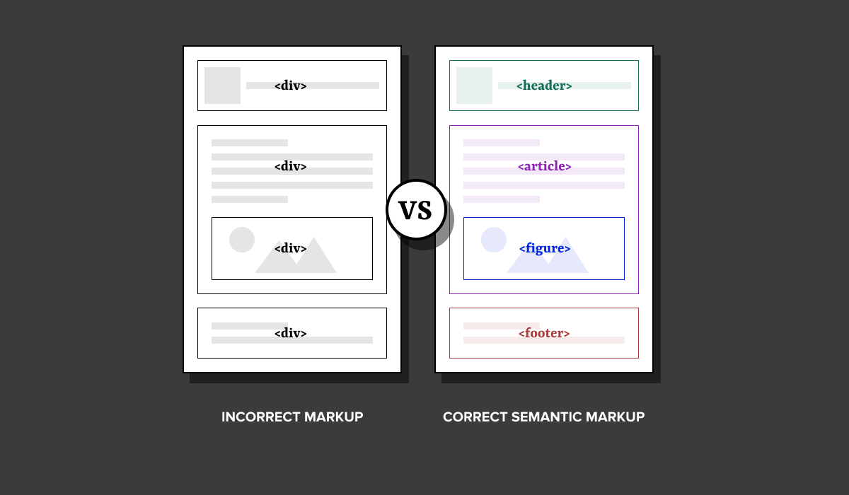
Pro tip: Avoid creating custom components if there is a reasonable native HTML tag alternative (e.g. use <header> not <div id=”header”>). These native elements are already accessible, and creating custom components can bring lots of accessibility issues.
Make sure your website is assistive technology-friendly (for keyboard users and screen readers)
Websites need to be tested for ease of use—not just with a mouse but also with a keyboard and screen reader. Make sure your content is properly programmed to provide the right context for users as they use these tools to navigate your site (e.g. ARIA attributes).
For example, if you're linking to an external resource from text that says "article," you need screen readers to tell the user where that link is sending them if they choose to click it. This can be done by developers using ARIA attributes, so the screen reader would read the link as “Article on website accessibility by Fuel Made" instead of just "article."

Every website should also be able to be navigated with just a keyboard. And the tab order must be logical and intuitive (top to bottom, left to right).
Also, if an element is not visually displayed on a page, it shouldn't be tabbable either (e.g., if a slideout cart is closed, a keyboard user should not be able to tab inside it).
It’s good practice to go through your site with your keyboard to make sure it’s offering a good user experience.
Note: Most ARIA attributes are absolutely necessary to pass an accessibility test and meet WCAG standards, but there are still some ARIA attributes that aren’t considered a requirement to pass (like in the example above).
The point is, adding this context for users, whether it’s required or not from a legal standpoint, is the best practice for users with assistive technology to make their experience better.
"Make sure when you're developing, you're choosing to use different methods to make things as understandable for people as possible—beyond just technically passing a test. You can technically pass accessibility tests, but that doesn't necessarily mean your website is as user-friendly as it should be."
- Hannah Beasley, Developer at Fuel Made
Additional resources: There are various tools used to run accessibility tests, which go through your website to pinpoint any accessibility issues. Two tools we use often are Lighthouse and Wave.
Visual elements need alternative text
Images, videos, memes—they all need alternate text to provide context for users. Anything on a web page that doesn’t have machine-readable content but is conveying information should have this.
While some writers claim alt text is beneficial for SEO, the main purpose of using it is to convey the information to users that may not be able to see the visual element.
Images should always include an alt tag. For graphics with charts and data, share a text alternative with the same information. For audio and videos, there should be both captions and text alternatives. This is so users with screen readers can get the value from the visuals on your site.
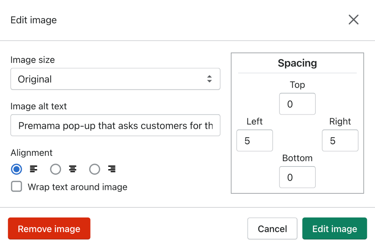
Note: Any images containing text require that text be included in the image’s alt description.
Alert users on state changes
When you fill out a form online but miss a question or answer something incorrectly, the web page will usually alert you about the mistake and show you which input field was wrong. This information needs to also be available programmatically and visually for users with screen readers to understand what field failed and why.
Instructions for users should be clear. If you tell a user to “click the red button,” then users who are color blind may not be able to see which button is red. Instead, writing “Click the button labeled ‘Submit’” is clear and any user would be able to find it.
Don't auto-play videos or audio
Web pages that auto-play video and audio can harm users who are at risk of having seizures. Also, it can be very distracting to users with certain cognitive disabilities like ADHD.
For any media, there also needs to be a pause function that can be used by clicking the space bar on a keyboard.
Accessible design considerations
Button size should always be a minimum of 42 pixels by 42 pixels
Ever tried to click a button that was crowded by other buttons and elements, and you end up clicking the wrong one? Studies say 42 by 42 pixels is the optimal button size for users.
Also, don’t crowd your buttons with other noise. And use color and design elements in combination to indicate when a user is interacting with an element, such as when hovering over the button or focusing on it. It’s important to make sure that the user knows what sort of interaction they’re having with an element.
Here’s a great example from Deque’s blog:

Source: Deque
In general, Hannah, a developer on our team, suggests avoiding a noisy web design. "Something that's helpful to think about when designing is just making sure you're not crowding things, and you're thinking about how the user is going to interact with the elements," she said.
Don’t just rely on color to convey information
Similar to what I just said about interactive buttons above, a lot of websites today will use color only to show when a user is interacting with an element, but this isn’t enough to help all users. For example, there may be users who are color blind, and a color-only interactive element doesn’t tell them anything.
This should be a general principle whenever there is a design element involved.
Use the right contrast levels
Bright yellow text on a white background is difficult to see without any visual impairment, so imagine how a person with low vision feels? This is why there are contrast guidelines.
Contrast measures the difference in brightness between two colors. The difference is shown as a ratio ranging from 1:1 (white on white) to 21:1 (black on white). The WCAG (Web Content Accessibility Guidelines) then ranks your contrast as one of three levels: level A (lowest), level AA (mid-range), or level AAA (highest).
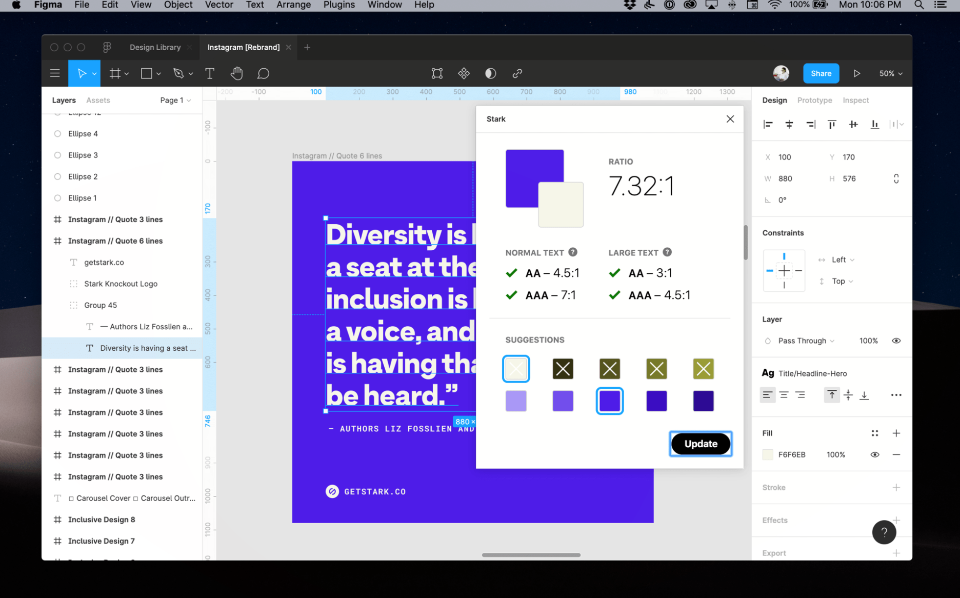
Source: Stark
"In a lovely world, I will always try to get to AAA. AAA is the most accessible standard. If their brand colors aren't going to make it to that and it's double A—that's still a win," shared Kellie.
An AA level is a passing ratio for contrast, but AAA is best for users with 20/80 vision who have contrast sensitivity and/or color deficiency. One of Kellie's favorite tools for checking this is Stark, which has plug-ins for Figma, Sketch, Adobe, etc.
Contrast levels apply to all website elements. For example, a button on a background color needs to achieve at least a 3:1 contrast ratio. Any elements that overlap or touch each other need to pass those contrast ratios.
In Kellie's experience, contrast is one of the accessibility requirements that isn't too difficult to do correctly—unless you're using orange.
"Color contrast is one I spend the most time educating clients about. If you really want to get an accessibility practitioner to have an eye twitch, tell them they have to incorporate the brand color orange. Orange is super hard to make accessible," she joked.
Accessible text considerations
Allow text resizing
Text needs to be able to be resized up to 200%. Some websites have a meta tag that prevents users from being able to zoom in (usually because there are incorrectly sized input fields on forms that automatically zoom the user in, and sometimes people want to prevent that). Make sure input fields are the right size and don’t disable zoom because there are users that need it.
Also, your content should never become unreadable or cut off due to resizing or device size, meaning users shouldn’t have to scroll horizontally in order to see something that was cut off. This is important because there are many users who need to increase text sizes and line-heights, and your website should be able to accommodate those needs.
Headers must be in a logical sequence
First things first, there should only be one H1 element per page, which is the main title of your article, homepage, product page, or landing page. It's used to communicate to users what the purpose of that page is.
The rest of your headings (H2, H3, H4) should descend in a logical order. So don't skip from an H2 to an H4.
Here's why: the number of the headings reflects the priority, and WebAIM’s 2017 Screen Reader survey explains that people using assistive technology rely the most on these headings as a way to locate information.
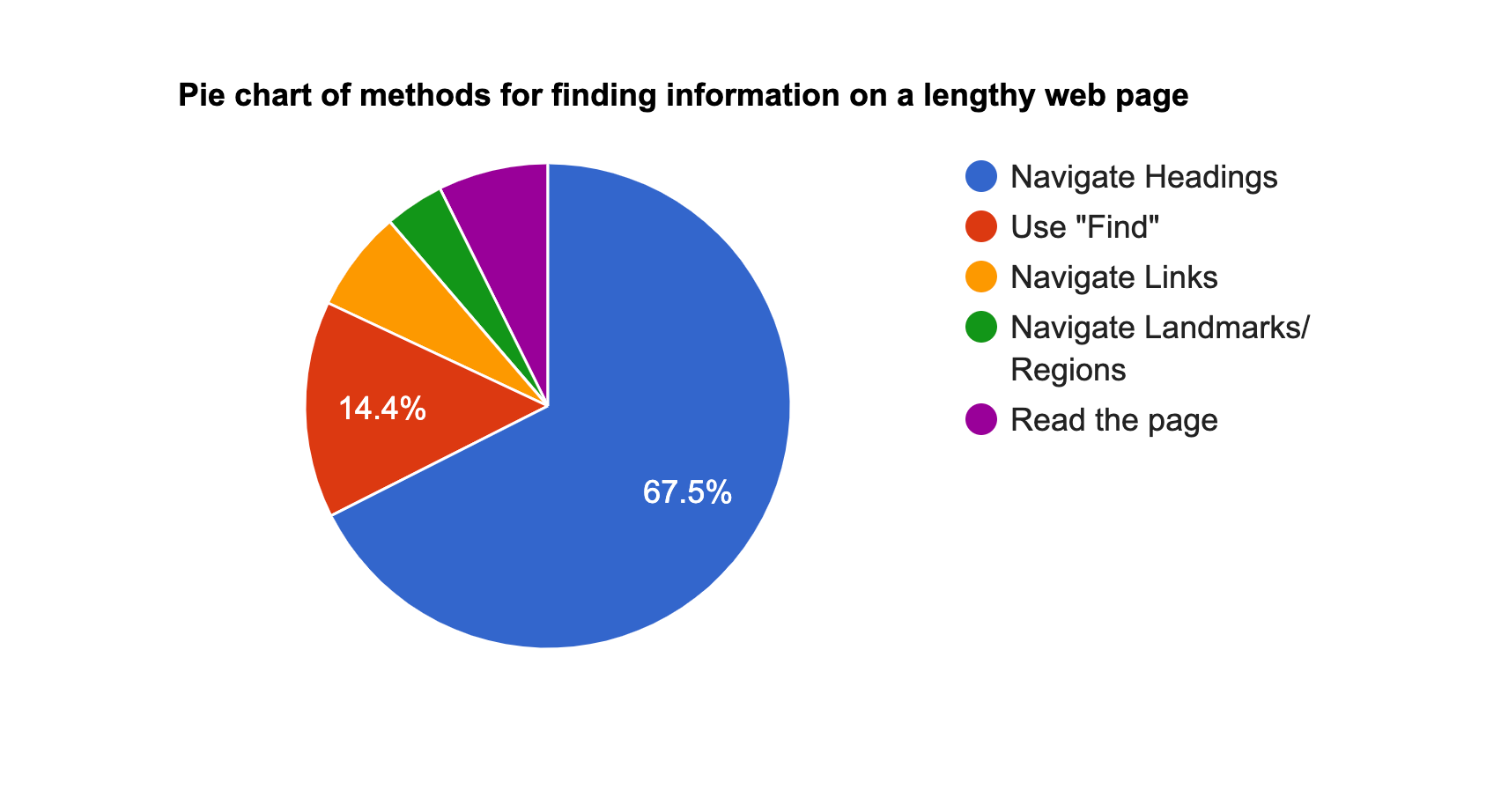
Source: WebAIM
Most content management systems will allow you to input the correct heading tags without needing to go into the HTML.
Mobile accessibility considerations
Allow screen rotation
There are two main reasons why it's important to allow screen rotation:
- Users with dexterity impairments need to be able to use their device in the screen orientation they can work best with.
- There are users with low vision who find looking at websites horizontally allows them to see the website content and read the text easier.
And don't forget to test that your website still works well and looks good while in landscape mode before you publish it.
Make it easy to click buttons and links for all hand and stylus sizes
W3 explained this best:
"The intent of this success criteria is to ensure that target sizes are large enough for users to easily activate them, even if the user is accessing content on a small handheld touch screen device, has limited dexterity, or has trouble activating small targets for other reasons."
This includes menus, buttons, social links, and gallery viewers—just to name a few.
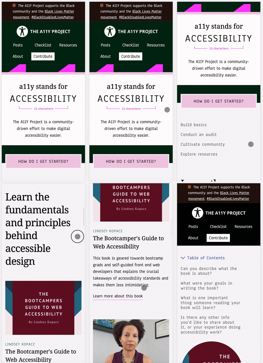
Don't cram interactive elements together—users need space to scroll
Ever tried to scroll on your phone but you accidentally clicked a button that takes you off the page? It's frustrating. And this happens more often with users with motor control issues that are trying to navigate an inaccessible website.
This is why Hannah says, "You've got multiple types of people who are using websites, and you want to make sure that as many people as possible can use the site easily and understand the content that is showcased on it."
Leave enough blank space for users to be able to scroll on their mobile device without accidentally clicking an interactive element.
The A11Y Project’s website does this nicely:
Source: A11Y Project
What about an app?
As you’ve been reading, you may be wondering: can’t I just install an accessibility app?
Here’s the truth: widget and overlay vendors do not protect you from ADA lawsuits, nor do they actually make your website user-friendly for people with disabilities.
Hannah and Kellie recommend building accessibility straight into your code, while also creating and uploading content that is accessible on its own. This keeps it under your own control (and it also helps reduce page speed issues that come from running third-party apps).
In fact, in the last six months of 2020, accessibility cases against companies using widgets and overlays were filed at a rate of one per day.
"The big discourse in accessibility right now is the quick fixes and overlays—that one line of JavaScript will change everything. And that's not true. That's actually more of an issue to combat now. To have an accessible product, you've got to pull it back and rethink it. You can't just slap on code and hope it works.”
- Kellie Kowalski
Summary: avoid accessibility tools and apps as "quick fixes." Accessibility standards today are much higher than these apps can achieve for you.
But wait! How do I make my Shopify store ADA compliant?
As we mention above, we know from previous court cases that the best practice is for your website to comply with (WCAG) 2.1 AA success criteria. This criteria contains 50 requirements.
There are four categories that WCAG’s success criteria falls into:
- Perceivable: Information and user interface components must be presentable to users in ways they can perceive (e.g. provide alternatives for time-based media.)
- Operable: User interface components and navigation must be operable (e.g. make all functionality available from a keyboard.)
- Understandable: Information and the operation of user interface must be understandable (e.g. make web pages appear and operate in predictable ways.)
- Robust: Content must be robust enough that it can be interpreted reliably by a wide variety of user agents, including assistive technologies (e.g. maximize compatibility with current and future user agents, including assistive technologies.)
You can read about every criteria in-depth here.
It can be a bit overwhelming at first glance, so we’ve created a handy ADA website compliance checklist to help you along the way. It will provide you with the minimum Level A and AA WCAG 2.1 requirements. If you do everything on this list, you should be pointed in the right direction.
You should aim to meet all 50 requirements, though not doing so doesn’t mean your website isn’t accessible. But it’s important to ensure you’ve covered your bases.
Once you’ve done your best to meet each of the 50 requirements, do a gut check: what are the common paths that visitors take when they land on my site? Prioritize these paths and ensure everything is accessible on a shopper’s journey.
Optimizing your website to be accessible isn’t as hard as you think
Hopefully, this article helps you understand the importance of website accessibility and choosing a user-first approach to your online shopping experience.
As quoted by Eric Bailey, a Boston-based designer, “Disability is a way of experiencing the world, not a problem to check off a list.”
And remember, the web accessibility initiative is about providing a user experience that's equal to everyone—not just about avoiding a lawsuit.
Good luck!
"There is like a lot of anxiety about accessibility because it's becoming such a big legal issue. But if developers can remember that HTML is inherently accessible—if used the correct way—that helps dispel some of the fear. It's not like you have to come in and do all these really fancy things to make a website accessible. Just write your markup the way it should be written, be mindful and careful, and you'll be just fine."
- Hannah Beasley
Resources to learn more about WCAG 2.1
If you're here, it's likely that you've recognized your website has accessibility problems. It's great if you're working toward improving that!
To learn more about accessibility requirements, here are a few resources for you, your web developers, or your designers:
- Introduction to web accessibility (W3)
- Accessibility (W3)
- Accessibility basics (Usability)
- Accessibility for designers (Kellie Kowalski)
- The accessibility developer guide
Resources for other countries
While every website should aim to offer the best user experience, the laws do vary a bit in every country. Here are a few links to learn more about accessibility laws in your location:
- Canada: How to get started with website accessibility design and testing (BitBakery)
- Australia & New Zealand: Web Accessibility Laws in Australia & New Zealand in 2021 (Rev)
- China: Law on the Protection of Persons with Disabilities 1990 (W3)
- Europe: What Is The European Web Accessibility directive? (Siteimprove)
- India: Rights of Persons with Disabilities Act, 2016 (W3)
- Japan: Basic Act on the Formation of an Advanced Information and Telecommunications Network Society (W3)
For a full directory of countries, visit W3’s web accessibility laws and policies page.
This article was co-written by Laura Kluz and Tina Donati.
