Missing or poorly described alt text is a common pitfall for ongoing content accessibility, and writing good alt text is just as much an art as it is a science. How detailed your text should be depends on the content and context of that image.
What is alt text, and why do I need it?
Visually impaired users often use assistive technology to access web pages.
This tech can take the form of screen readers, which read out the contents of the page, or braille terminals that output the content as braille text.
The alt attribute gives visually impaired users access to the content of an image they can’t see. This is especially important for conveying informational images, so all users have access to all the relevant content on the site.
Alt content is determined by context
A photo of this waterfall might use the text “A summertime view from the back of Seljalandsfoss at sunset, just as the sun reaches the horizon line.” This works great if the context of your article is Icelandic Tourism.

But if this article was talking about photography techniques, this alt text could just as easily say “A waterfall shot during golden hour affects the lights and colors of the composition. A telephoto lens allows for a wider photo with a shorter focal length.”
Which text is the most helpful? It depends on your context. In fact, the alt text for this article is completely different as well.
Do all images need alt text?
Not all images necessarily need alt text, and there are a few instances where it’s ok to not have it. In this case, we’d consider them “decorative images.”
How do I know if it’s decorative?
This is where there’s some gray area because this is a judgment call for the author to make. But according to the Web Accessibility Initiative, decorative images are:
- Supplementary to link text to improve its appearance or increase the clickable area; In this case, the image is used to make the link easier to identify and to increase the clickable area but doesn’t add to the information already provided in the adjacent link text (of the same anchor).
- Illustrative of adjacent text but not contributing information (“eye-candy”); In this case, the image is used only to add ambiance or visual interest to the page. One example background image that’s described by the text it’s behind.
- Identified and described by surrounding text. In this case, the image is already sufficiently described by the adjacent text. There is no need to repeat this information.
In order to have blank alt text work, however, your code needs to be set up properly. An image element without an alt attribute will read the filename instead, which creates a painfully frustrating experience.
A correct empty alt attribute is ignored by assistive technology, like screen readers. It would use this code:

An incorrect empty alt attribute will prompt a screen reader to say “Image, myphotoa1234bcde.jpg”. This will not help the user and will create red flags in an automated accessibility scan. An incorrect image tag looks like this:

Common ecommerce contexts
In a Shopify store, odds are you’ll be splitting your assets between product and lifestyle shots. So how would you best describe them? Here are a few examples applied to a variety of shoes, depending on each one’s context:
Thumbnail Image

Alt text: The McGuffin Chukka Boot, black
Gallery Image

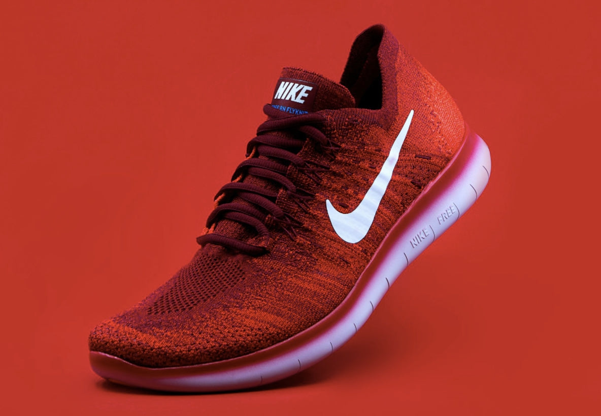
Alt text: Nike Fly Knit low-top runner in Fire Red, three-quarter view showing the swoosh on the outside of the left shoe.
Collection Image

Alt text: The Cottage Core Collection features vintage suede saddle shoes in mint green.
Blog Post Image

Alt text: The summer style edit flat lay shows the Nike Fly Knit running shoe in charcoal gray, with a matching tote purse. Its contents are spilling out revealing a brightly printed silk scarf, brown sunglasses, and red lipstick. Green monstera leaves are strewn about on a light peach background.
How long should it be?
It’s important to keep alt text concise at around 140 characters. Screen readers can’t pause in an alt section like the rest of a text document, so stick to the length of an average tweet.
You can use full punctuation in alt descriptions, which is helpful for the pacing when it is read aloud.
Embedding text inside images

This is still a surprisingly common occurrence, and you should avoid doing so. Text in images aren’t responsive and can’t be resized by assistive technology. For example, users with low vision acuity may bump up the browser’s default font size to read better. If you’ve put text in an image, it won’t scale the same way.
You also could run into an issue where the alt text becomes too long. How would you describe a graphic with multiple headlines and several lines of body copy? It’s too much to add to the image alt text.
If your content doesn’t fit your template, it’s probably time to update the design. The Fuel Made team can help with that.
I can’t overstate the value of well-thought-out image alt text. It’s an important part of any content strategy and should be a part of the skill set of anyone who writes copy for the web.
