In any design project, the homepage reveal is usually the most anticipated. It’s the first visual synthesis of all the work of strategy, discovery, wireframing, and style guides, put together into one tangible, meaningful deliverable.
We wanted to give a little snapshot into some of our design decisions, in relation to Supply - a growing ecommerce company we work with. The goal here is to show you how we think about design, so you can apply the same approaches to your own store.
Note: Supply’s homepage is already good, even before we got to it. It has all the elements needed for a homepage to perform well (and it does.)
But it can be better. And that’s where we come in. 😉
First: Why the homepage is important, but maybe not as important as you think.
Clients often view the homepage as the face of the online storefront, and that carries a lot of weight. In our experience, many clients feel an urgency to show everything, and be everything on the homepage. But this can create information overload, and often a disjointed presentation of who you are, and what you sell.
“We've always had a challenge figuring out how to educate customers without overwhelming them with too much information." - Patrick Coddou, founder, Supply.
When we look at Supply’s data, the homepage accounts for less than 20% of traffic. From that number, more than 60% are coming from social media channels, which generally bring more top-of-funnel visitors. So these tend to be visitors who are interested in learning more about a brand, and may not be quite ready to make a purchase. The approach we recommend in this case is to target the homepage to this top-of-funnel group (those with more purchase intent can still work the navigation and get where they need to go).
With this in mind, a key change we made was to strip down Supply’s homepage to shy away from product specifics, and speak more to selling the benefits of the product, who Supply are, what they stand for, and of course why you should buy from them.
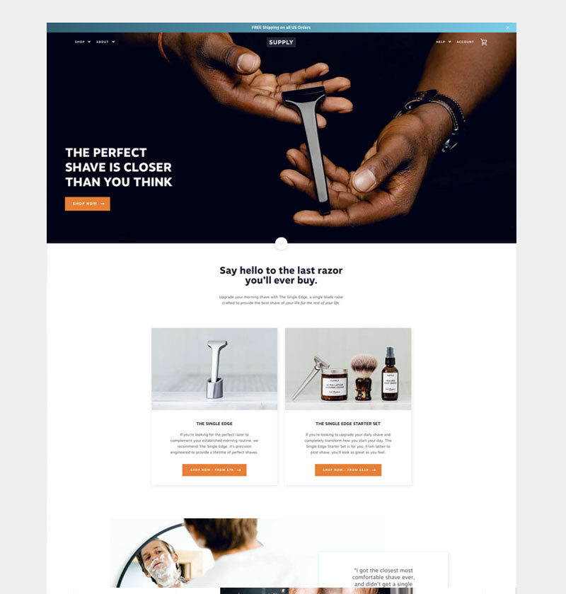
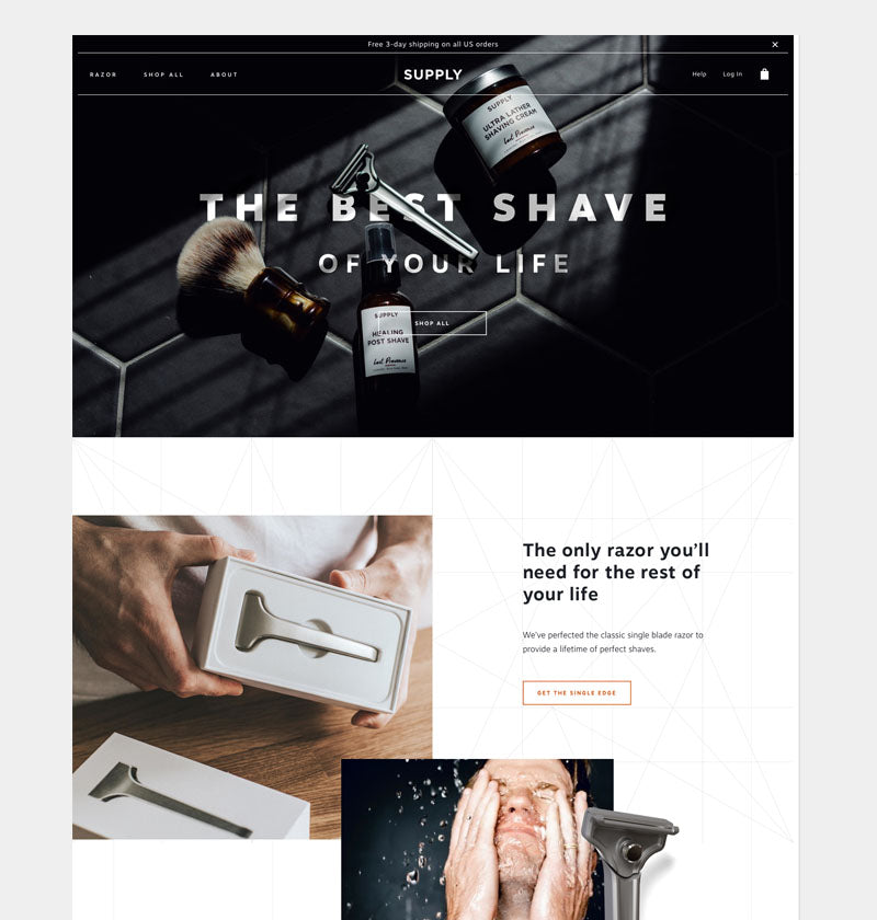
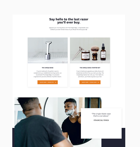
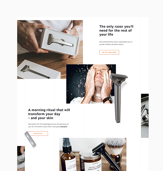
For reference, here is Supply’s current homepage versus the homepage Fuel Made has put together:
Let’s walk through each section and discuss the changes we made and why we made them. Keep in mind that our overarching goal with the homepage is to create a cohesive brand story that takes the user on a linear journey: introduce, educate, convince.
At first glance
Supply has solid existing copy and imagery that tells the right story and has the right message, but it could be made more clear.
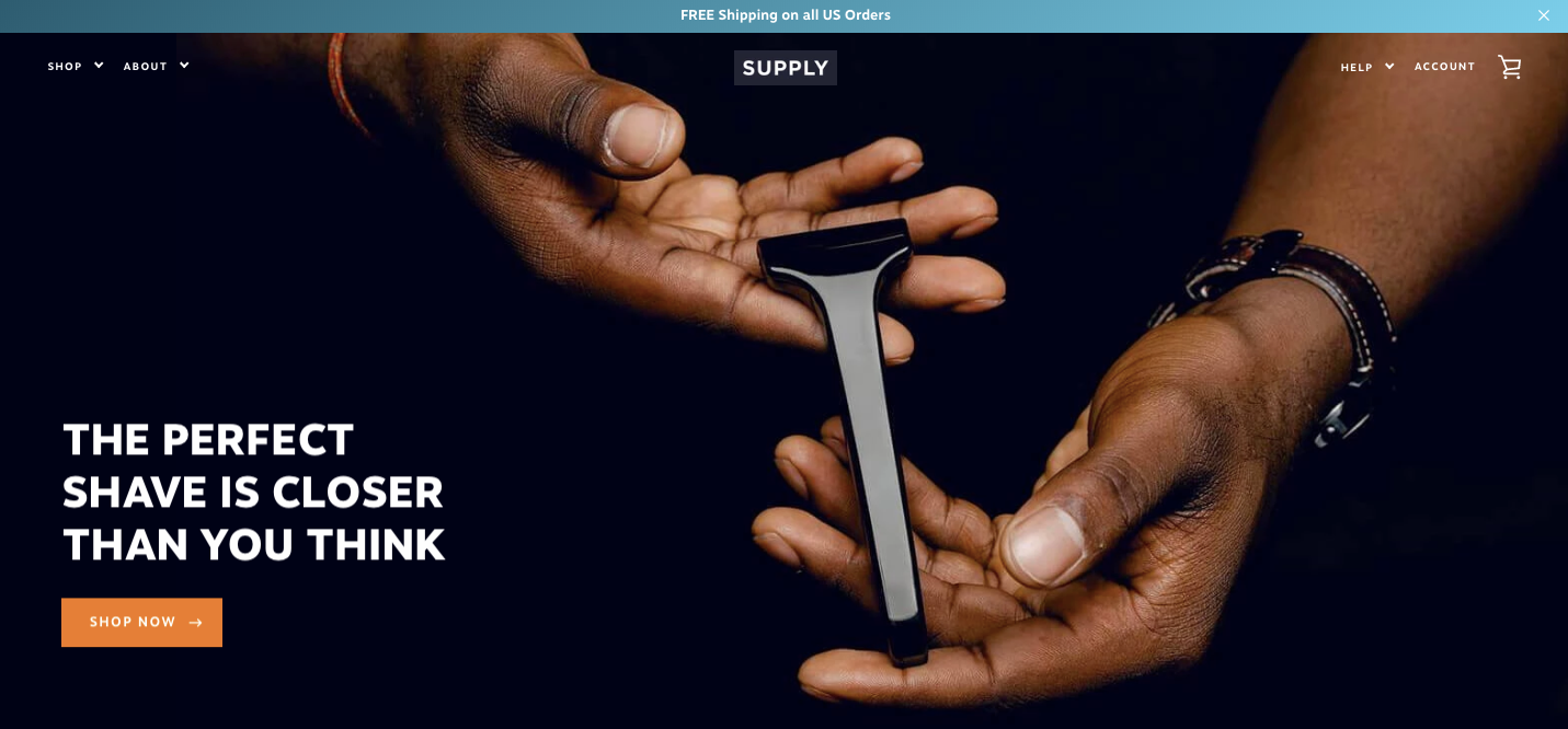
The hero headline is often a visitor’s first exposure to the brand. It’s the hook to get them to keep exploring, and it sets the tone.
In spite of the pun value, on first pass visitors may not connect the word “closer” here to the type of shave they’re promising. They might not actually know what it means that “the perfect shave is closer than you think” For example, Is the razor coming soon? Is this a Kickstarter thing? What’s happening?
Also, while the image of the razor works, it creates the impression that Supply may only sell razors.
But what if we declare this, right at the top, along with imagery of additional products?
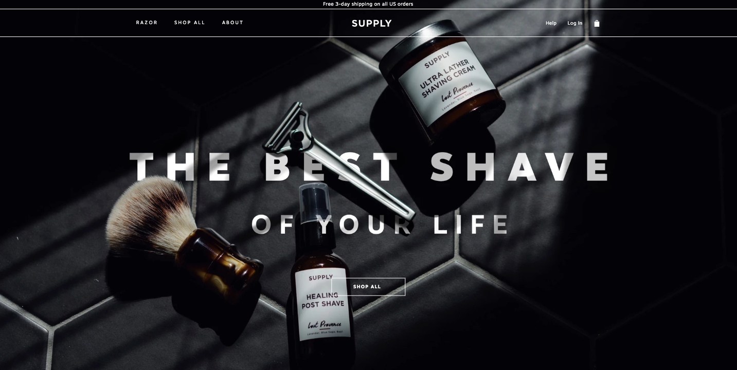
This treatment supports Supply’s overarching mission:
“To be a destination for men's personal care and create a wellness-focused community customers return to for all personal needs.”
So we’re not just selling a razor, we’re selling the The Best Shave of Your Life. It’s clear, confident and speaks to the benefit of purchasing their products.
Our Story Begins
After making the bold statement The Best Shave of Your Life, we need to provide context to back up the claim. So as users scroll down the page, we explain why this is the best shave of your life.
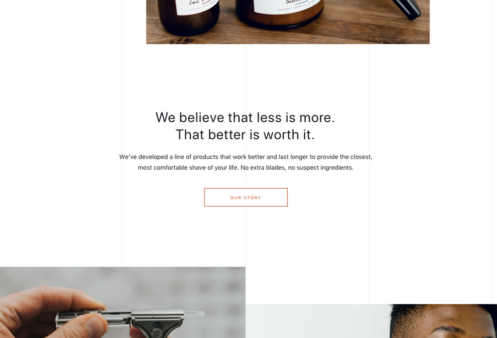
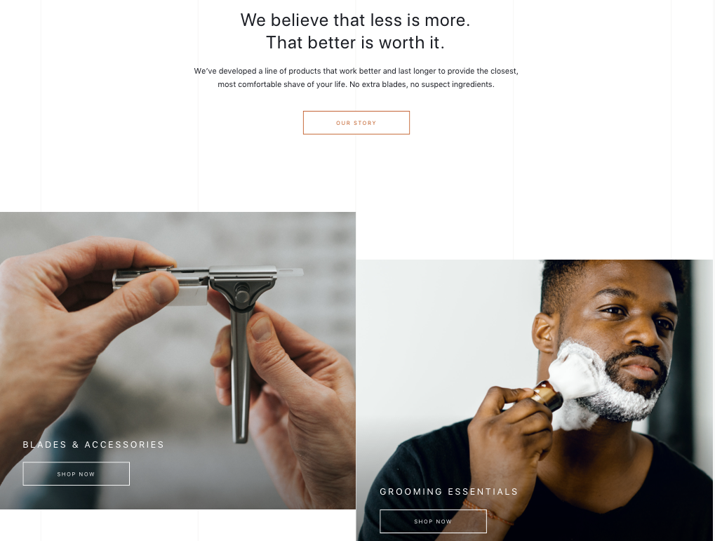
That’s why we shift our focus to the high quality of their signature product - the only razor you’ll need for the rest of your life. We cut down the words, keep it simple and add lifestyle imagery to reinforce the message that this shave is the best you’ll ever have.
We continue this messaging into the next section, where we declare it a morning ritual. Since Supply sells more than a razor, we bring attention to additional items they sell (for example, their Starter Sets), while simultaneously speaking to the benefits, rather than the products.
Why they do it
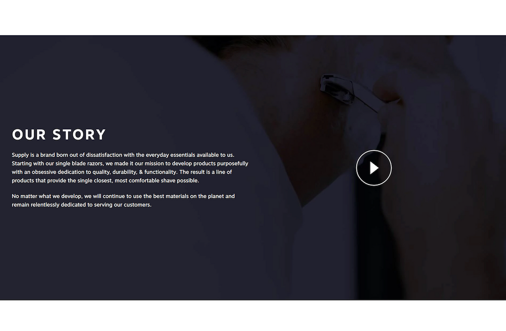
Once we state our claim (The Best Shave of Your Life) and give evidence to back it up, we turn to their personal brand story. We’ve already communicated what Supply does, now it’s time to explain why they do it.
So we moved their brand story up to give it higher priority on the page. Rather than explaining their story straight away, we keep it short and sweet, inviting visitors to learn more about the brand if they want.
Not losing focus
As we move through the homepage experience, it's important to remember that our primary goal is to move the user into the shopping funnel. We need to communicate the brand story, but we also need to give them a chance to shop.
To facilitate this, we added shopping features to their homepage. This gives Supply the flexibility to put focus on product launches, gift guides, sales and best sellers, etc., while keeping the homepage fresh, and seasonally relevant, all geared to pull the buyer into the shopping funnel.
What they stand behind
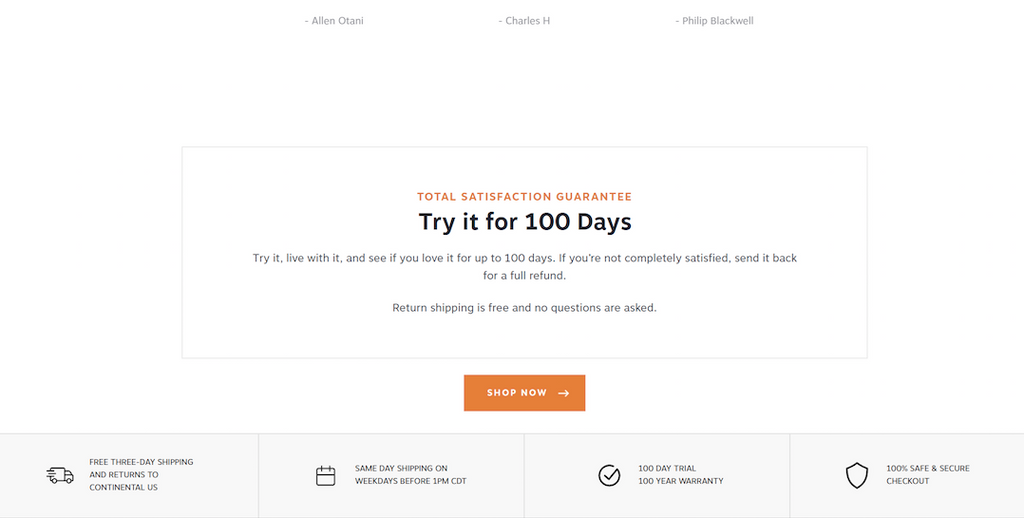
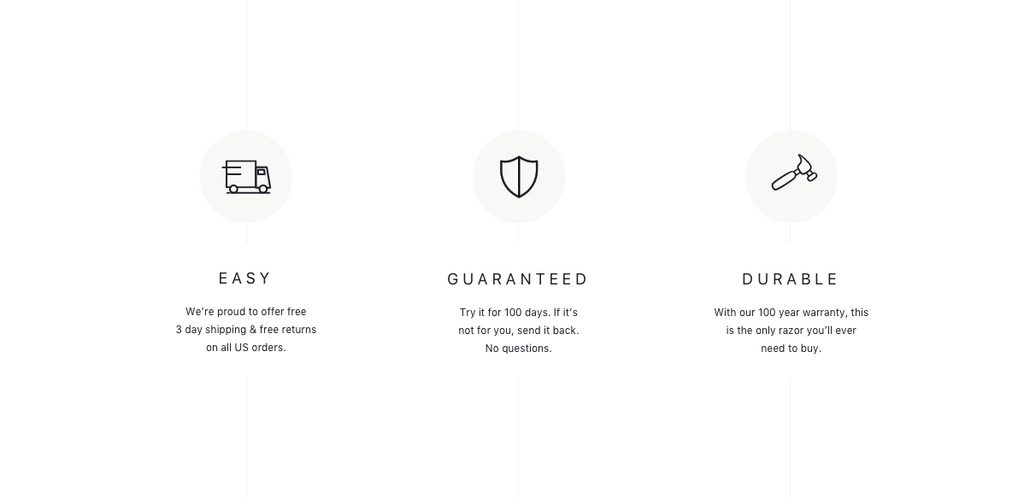
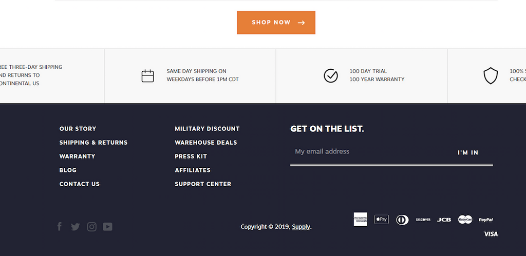
If visitors haven’t yet committed to entering the shopping funnel, it’s time to put customer concerns to rest and explain Supply’s ecommerce value propositions. These are customer-centric factors that differentiate their store from the competition. Typically this includes things like shipping & returns, free trials, warranties and other policies.
You’ll notice we bumped up Supply’s value props from their footer. We did this because their strong customer-centric policies do a great job of convincing a shopper to buy. (For more about customer-centric thinking, head over to this page where we talk about this in more depth).
Social Proof
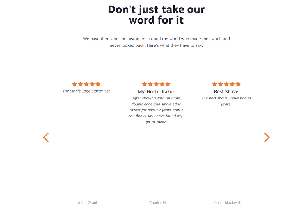
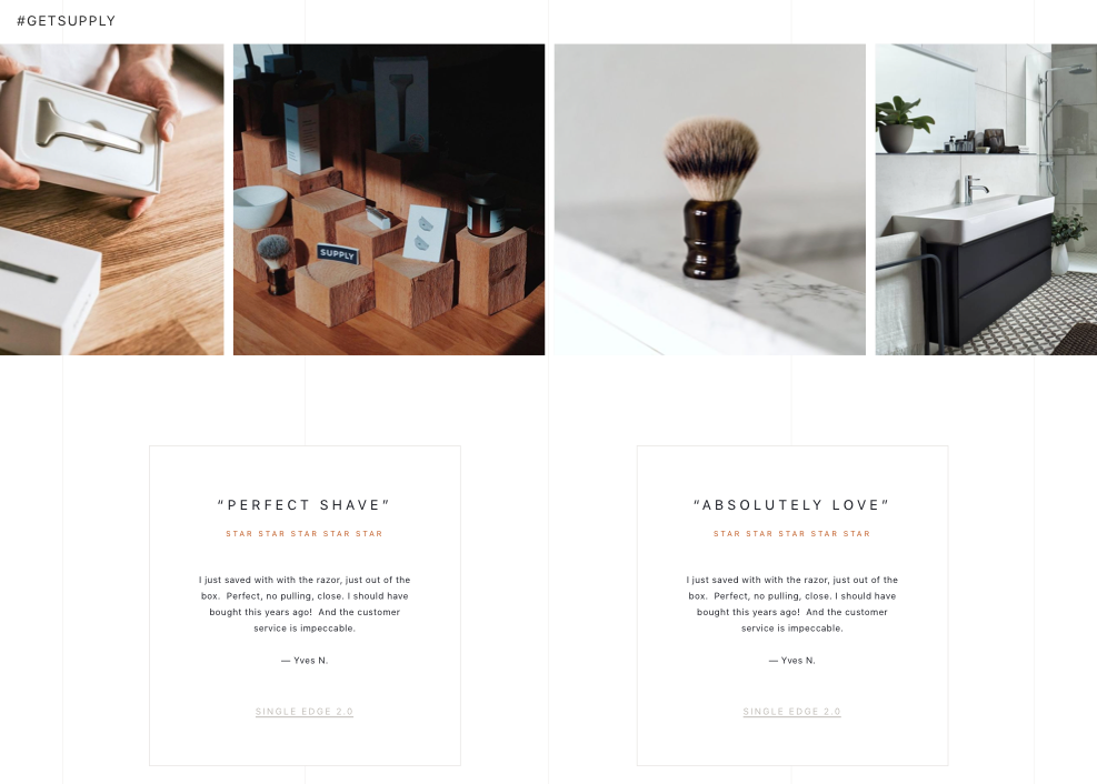
Finally, as we progress towards the end of the page, it can be very effective to provide social proof for visitors who might be hesitant. That’s why we dedicate the bottom third of Supply’s homepage to it: a featured press section, a live Instagram feed (#getsupply), and user reviews that act as a final effort to persuade visitors to shop.
The footer
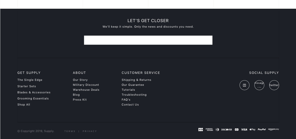
Our discovery process with Supply identified email marketing as a significant opportunity for growth. While their current efforts are converting well, email marketing only accounts for 5% of traffic. List building is an important strategic objective for most brands, and Supply is no exception.
So we increased the visual prominence of the email subscription box, and then instead of asking visitors to simply enter their email address, we invite them to get closer, playing on the type of shave their product will guarantee. Committing to how we want the customer experience to feel.
It all comes together
There you are - a new, updated homepage for Supply that takes into account data, strategy and brand voice. We apply this same process as we move through design on additional pages. You can read about Supply's product page design right over here.
So how did these changes work for Supply?
Following the launch of their new site, Supply has seen a nice improvement in homepage conversion rates: 126% increase for desktop and 130% boost for mobile (for visitors landing on the homepage).
This same design-thinking was also applied to Supply's product page... and their conversion rate has risen 101% as a result. You can read all about the changes we made on this key page here.
You can also read about the results from the rest of our efforts with Supply here.
