Large, full-screen images are a standard part of web design. And as monitors get more advanced with higher pixel density and larger sizes, these files can get really big really quickly.
Did you know that image sizes are a factor in calculating your site's performance score? Not to mention, downloading large assets (like images) from a server can impact your website’s page speed.
There's a balance to be struck in showcasing photography and getting decent performance from the site. It's not a perfect science, and sometimes you have to accept the tradeoffs.
Let’s talk about compressing your images so you can add them to your website without it impacting your page speed.
Tricks for image compression
When I prep assets for the web, I'll actually size my document at 2x, then save for web at the lowest jpg image quality setting possible.
Once it's on the website and sized at half its dimensions, the compression artifacts can barely be seen. It's a good compromise between site speed and image resolution.
The Process
Let's say we have a full-screen, responsive background hero image. I'll size my photo to 2 times an average mid-size desktop dimensions, so it scales down just fine on smaller screens.
Anything larger and you'll end up with an image that will be pretty huge in file size—for what's more of an edge case.
My desktop hero size is 1440px x 768px, so my image size should be 2880px x 1536px. Since it's responsive, let's give it a little 100px bumper top & bottom, so now we're at 2880px x 1736px.
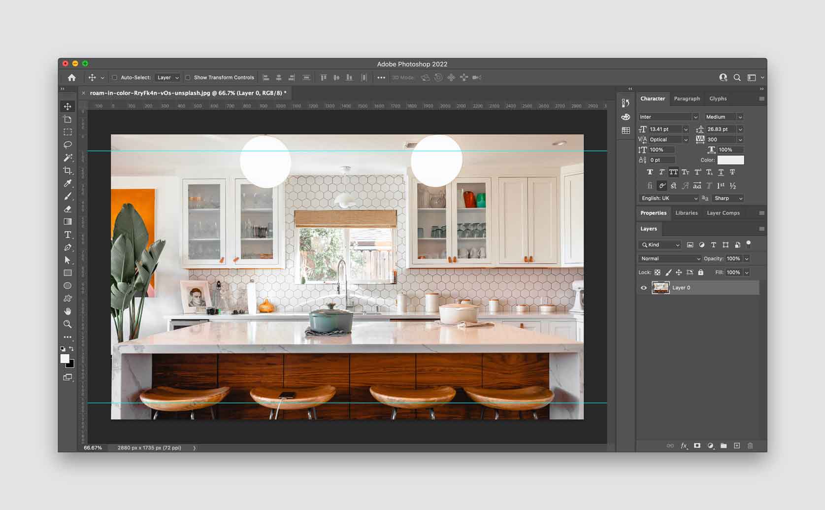
I still prefer the legacy “Save for Web” in Photoshop, and once in that dialog, I'll choose jpg and low quality. I'll run it through Tiny PNG after that, but it rarely compresses any further.
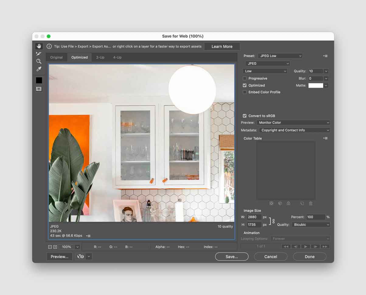
Why not 1x at high quality?
Saving the image 1x at high quality just gets you a big file with middling resolution on retina screens.
Here are two files exported out of Photoshop: 1x at 80% compression quality and 2x at 10% compression quality.
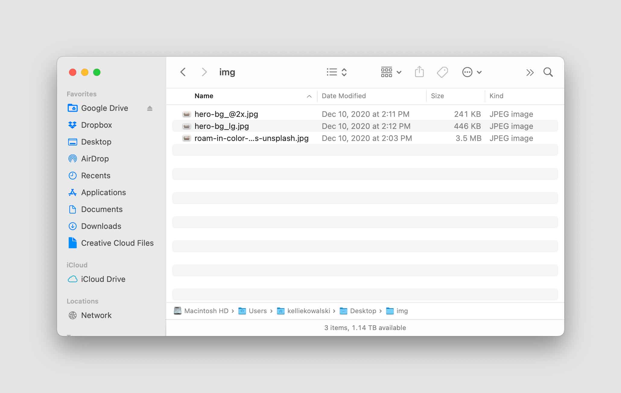
Now here are those same files run through a compression site. The 1x has shrunk in file size, but the resolution and image quality is the same.
Again, when we size our 2x file down to 1x dimensions in the browser, it actually looks higher resolution than it really is.
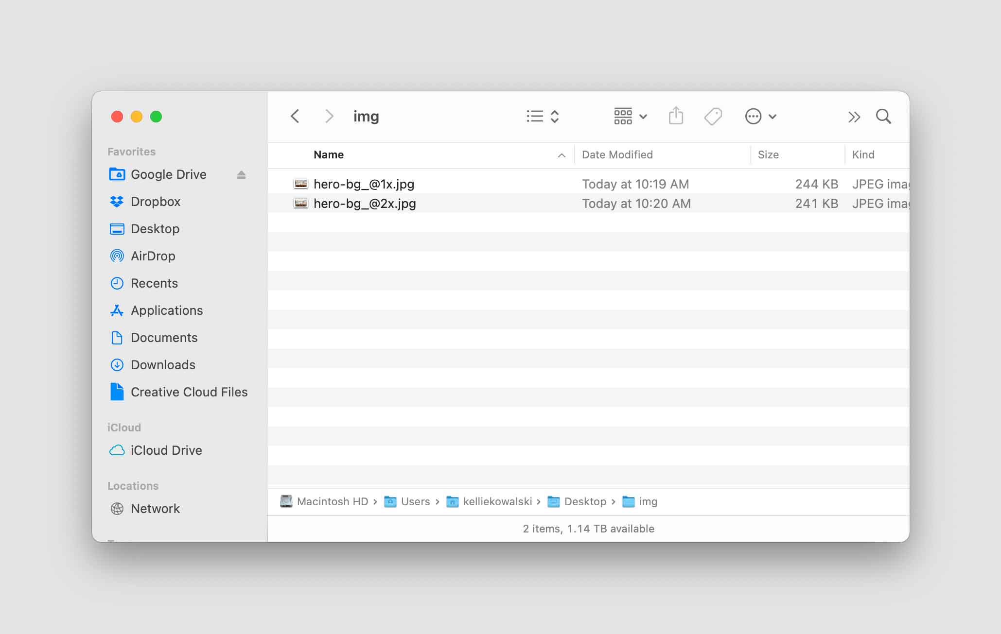
Let's compare all three exported file types
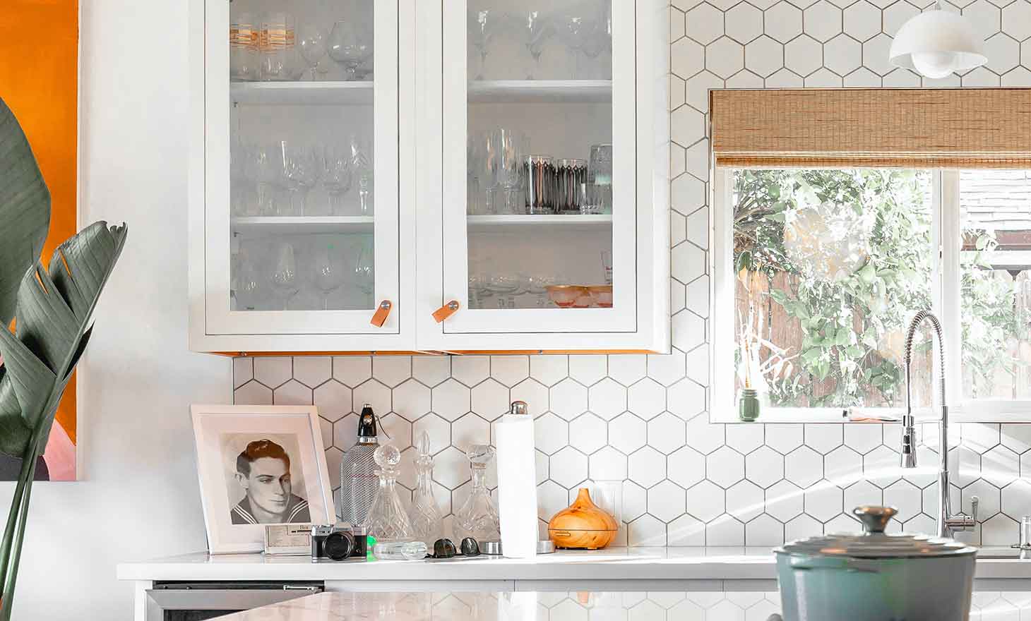
While older monitors don't really see a difference, the 2x / 10% image actually looks the sharpest on a retina screen.
There isn't a measurable difference in the 1x except for the file size.
1x compressed by Photoshop at 80% - 446 KB

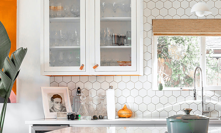
1x compressed by Tiny PNG - 244 KB
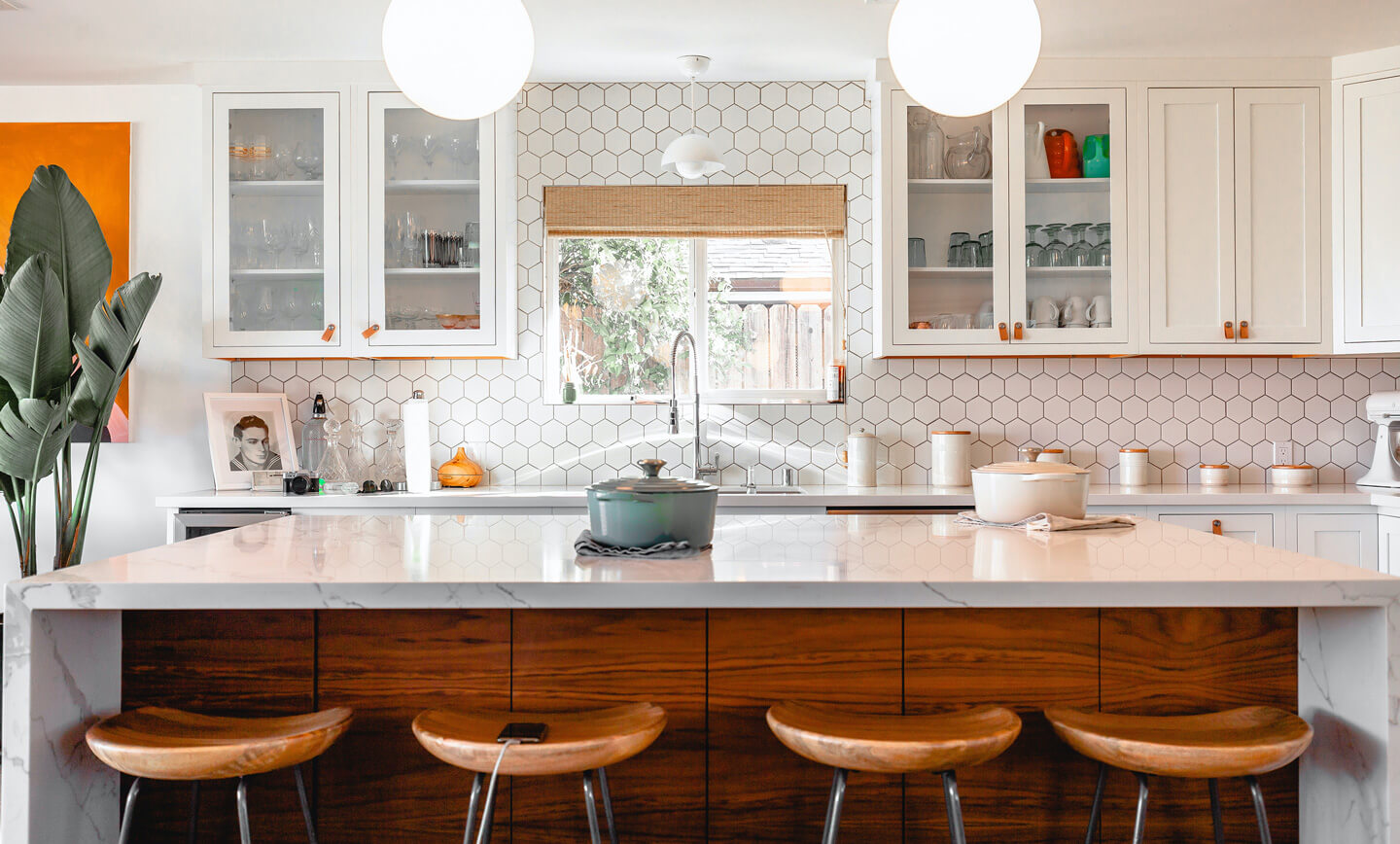
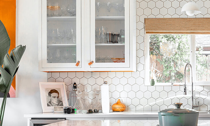
2x compressed by Photoshop at 10% - 241 KB

Now, try it yourself
If you’re working with really large background or gallery images, this method should help balance resolution and performance.
It’s worth bearing in mind that with responsive images, you’ll be working with an endless combination of browser sizes and device resolutions. But using this method will help you get sharper retina images with a smaller file size on the widest range of combinations.
